MAKING A PHOTO BOOK - PART THREE: FINISHING
Design, proofing, paper, and printing.
We’ve reached the final part, where the Making a Photo Book series is actually about making a book! This stage takes us away from the photography process, demanding a different level of patience and creativity. Putting together a photo book is a highly personal endeavor, but it’s important to realize that not every step is entirely yours to make. For the first time, other people will be introduced to the inner workings of the project. Everything is out in the open now, and it’s no time for ego. In this post, I’ll be talking through the design process, proofing, paper options, and finally printing the book. Everything I say is based on my personal experience, and your mileage may vary. Once again, this isn’t meant as a guidebook, but I’ll be detailing the hows and whys of my actions. Let’s get to it!
Book Design
Inspiration and working with a graphic designer.
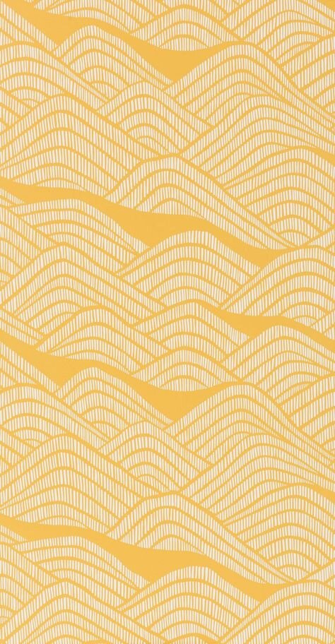
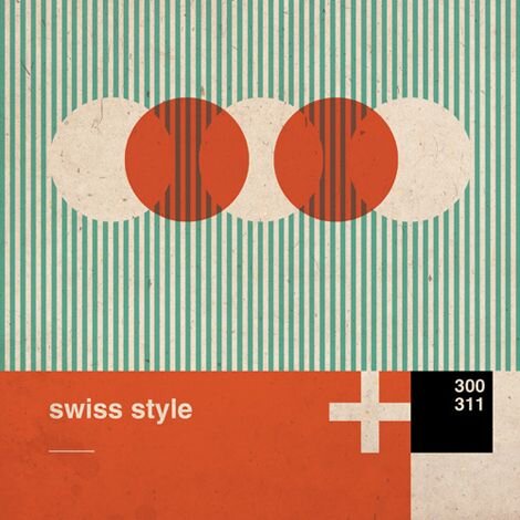
As shown above, you’ll see the images included in my Transmissions from Japan design mood board. The original board was much larger, with almost a year of constant additions, and the one you see above has been culled down tremendously. The original board included everything that caught my eye, and because of this, it was a mess. After leaving Japan, and as I got closer to my final set of images, I knew that I should hire a graphic designer to do all the things I couldn’t. I tried to make my vision easier to interpret by honing in on what I really loved about the board. This meant mostly getting rid of anything overtly Japanese, all of the dark and hyper-minimal stuff, and anything else that didn’t feel the way I wanted my book to feel. When I was happy with the outcome, I found someone who I knew could make this thing sing. The designer for Transmissions from Japan was Callie Mc, and she certainly worked her magic.
Judging by the fact that we’ve never met in real life, I’ve known Callie (and her other half Brandon) for way too long. Fun fact: for every physical work I’ve released, Brandon has bought every single first copy. If it was limited to fifty, Brandon got number one. I think that’s beautiful, and I love him for it, haha. Anyway, because of this pre-existing online friendship, I was already privy to Callie’s talents, and she already knew the kind of photography I made. While hiring a friend is by no means required, I think it helped immensely with the back-and-forth. We were both able to clearly and concisely talk through what was necessary, making the process from start to finish a breeze.
Based on the board, some conceptual notes, semi-final images, and a clarifying email or two, Callie came back to me with four different directions in which we could take the project. I spent some time looking them over, I asked some friends for their feedback, and I got back to her with my decision and some questions about specifics. On my end, the process from beginning to end was about refining. We started with broad steps, getting more and more precise as time passed. When the direction(s) was decided, Callie started work on the actual design. When she got back to me, she had two versions of the book that we could go with. We talked about small changes and final touches, and then we were finished. I make it sound simple and easy, but that’s because all I can give you is the correspondence. All of the hard work wasn’t mine to manage. Unfortunately, I can’t go into any details on the design process, and that’s exactly why I hired a designer :)
Callie was able to see past my scattered vision and make something that I wouldn’t have been able to properly explain. She offered color choices that I wouldn’t have thought of, fonts I wouldn’t have found on my own, and unique details I didn’t consider. The book in its final form successfully mixes photography and design in a complementary fashion. Nothing is superfluous, but nothing is bland either. If you ever have the opportunity to work with Callie, take it. She was a dream to work with, making Transmissions from Japan something I couldn’t have made on my own. I can’t wait for you guys to see the final product.
Proofing
Do not ignore this step.
So, let’s talk about proofing. What is it, why is it, and how did I do it? First, let’s talk about the different forms of proofing, that is, soft vs hard. Soft-proofs are images that are digitally altered to simulate the way they will look on paper. Hard-proofs are simply test prints to confirm the final result. For me, hard-proofs are essential. I’ve made the mistake in the past, specifically with prints, laying my trust in the digital soft-proof representation, and I’ve been burned. On the other hand, hard-proofs are exact. They act as confirmation that your photos look the way you want them to. When sequencing a book, it can be a great idea to cheaply print your photos, but this should not be used as a substitute for proofing. Cheap, drugstore-prints won’t act the same way as the premium photo paper used in books, because depending on its coating, tone, and texture, that paper can drastically affect the way your photos look. Spending the extra money on hard-proofs, using your final choice of paper, can save you in future headaches.
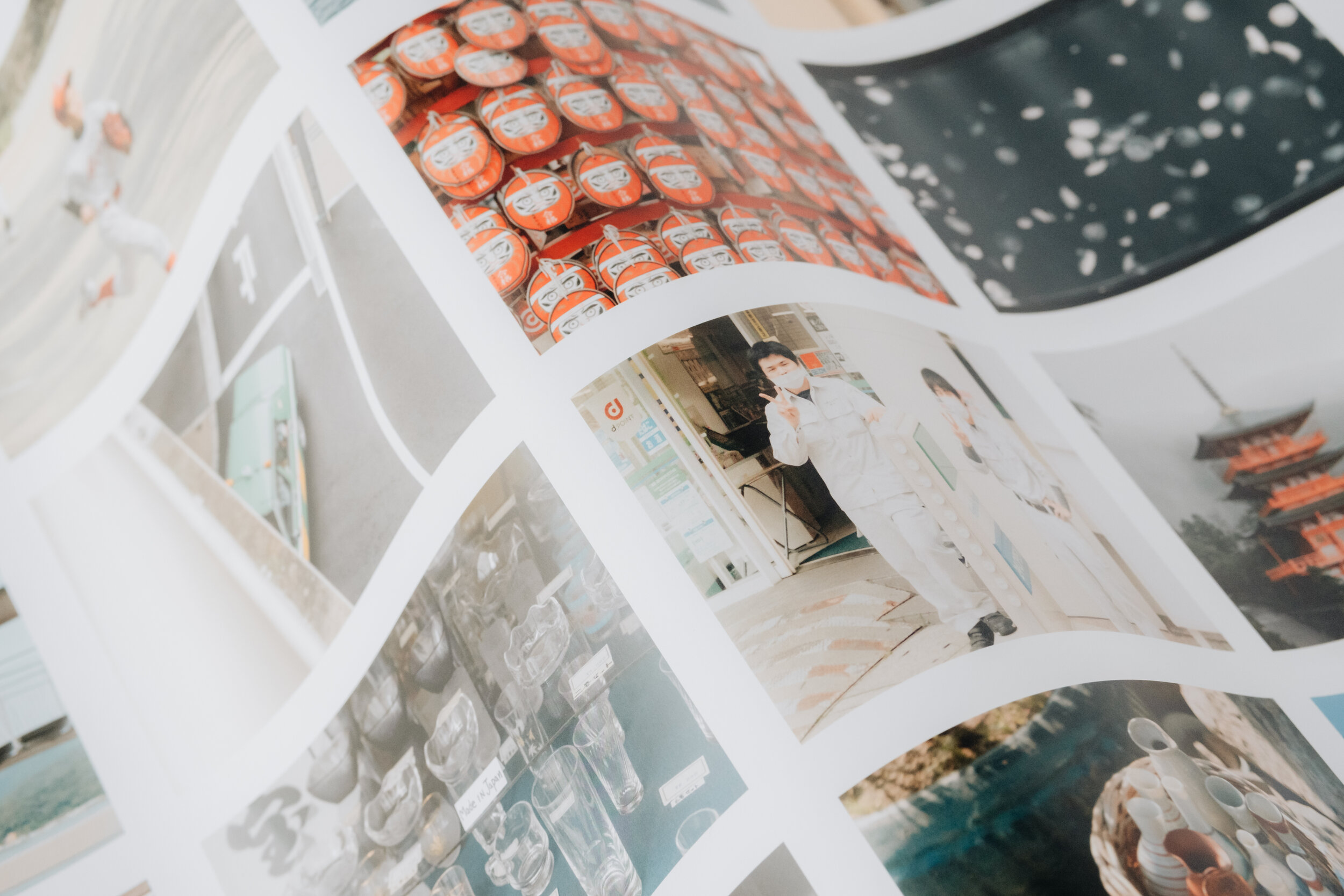
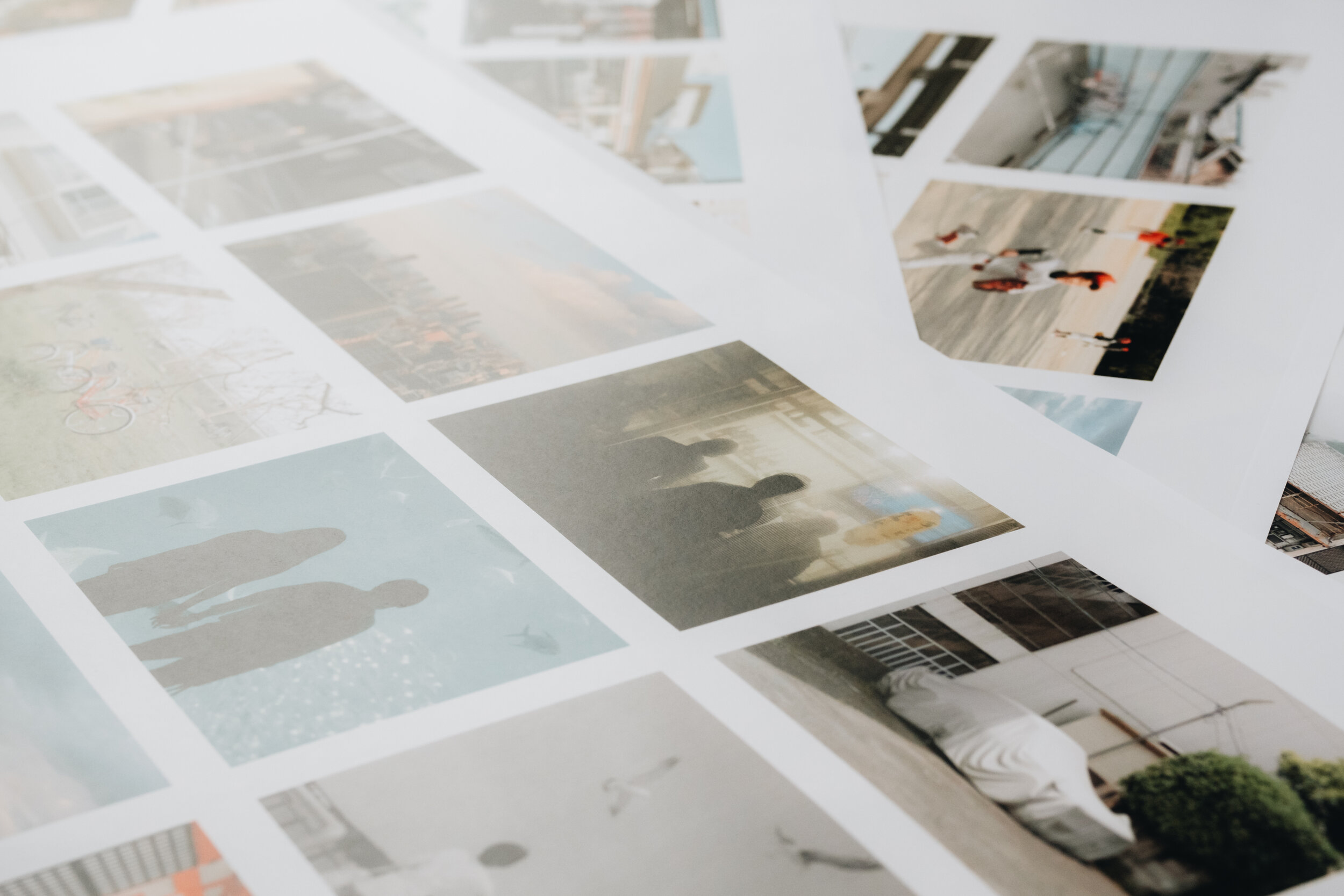
While making my book, I chose to get my proofs directly from the book’s printer. You don’t have to do this if you have another way of nicely printing your photos, but for me, it was the best option. I paid extra, but I think it was well worth it. I went with four B2 (19.7 x 27.8 inch) scatter-proofs. Scatter-proofs, as you can see above and below, are large pages with spreads of images, rather than small, individual prints. In an attempt not to show you every photo and ruin the book, I tried my best to creatively hide the bulk of them. Because of this, your view of the photos doesn’t perfectly represent what they look like. Things I looked out for in my proofs were as follows: general likeness, color reproduction, sharpness, and contrast. Luckily, as I mentioned in part two, color was not an issue, and the other things were easy to fix. While I would have been content with these as a final product, I wouldn’t have been ecstatic. Since something like a book takes so much time as it is, it was absolutely worth it to order these proofs. The touch-ups were small, but they will make a big difference to me in the long run.
Paper
Coating, tone, texture, and weight.
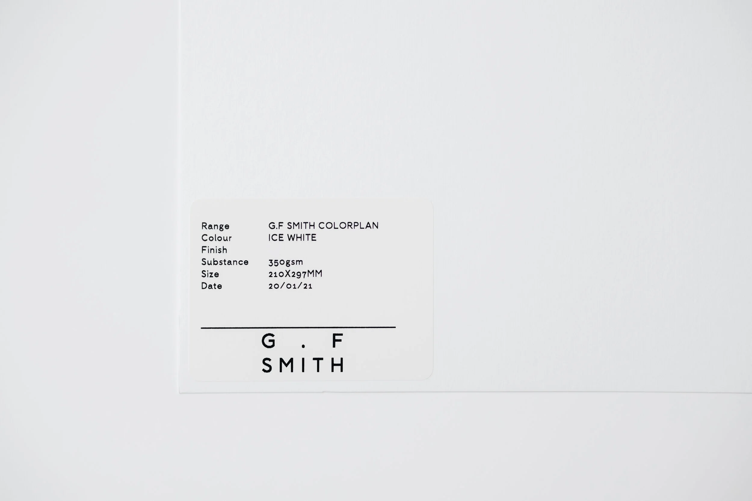
PAPER. There are so many, infinitely many options, and the last thing you’d want is to be stuck with a paper that you hate. Paper samples, thankfully, tend to be either free or very cheap, so there shouldn’t be any excuse not to test them out. Again, I utilized my printer to make this happen. They sent me samples of a few different papers that we picked out, and I took some time to decide on what I felt fit best. One of the first things worth deciding is the coating. Do you want gloss, matte, or maybe something uncoated and natural? This is important to figure out, as the proofing process will require you to choose ahead of time. You can always change your mind, but if so, I’d recommend considering another round of proofs. The options really do seem limitless, but talk to your printer and see what they think before you settle on one specific paper type. For Transmissions from Japan, I went with a matte, Arctic Volume White for the pages and a natural, Colorplan Ice White for the cover.
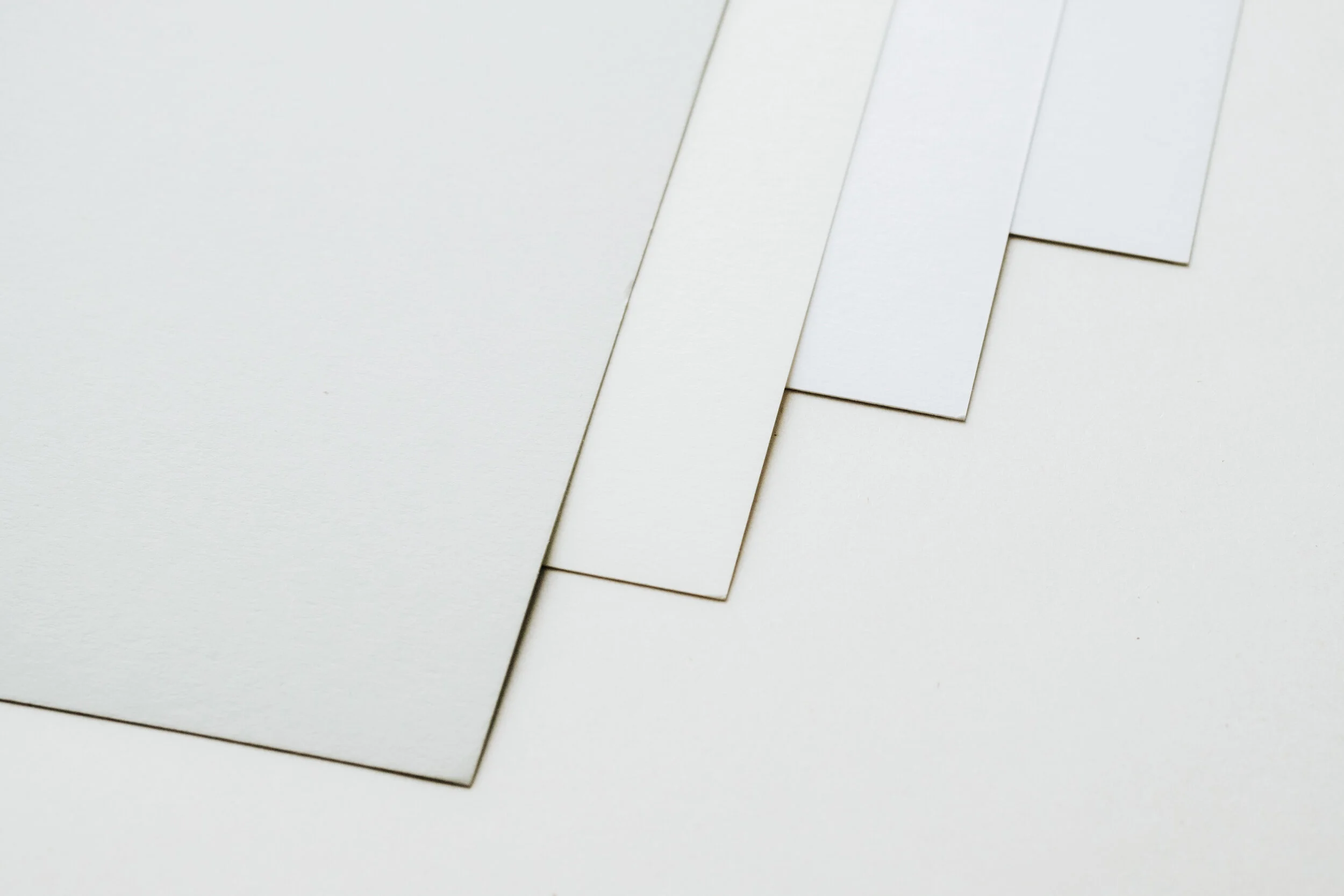
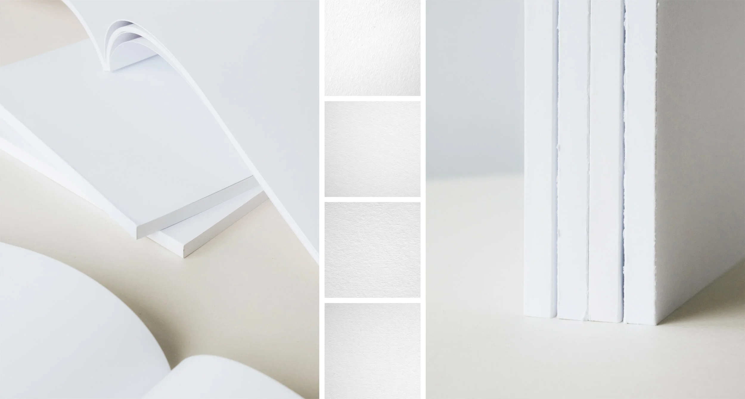
The tone of the paper is another important variable. As you can (barely) see above, the four sheets of paper are all different colors. Going from right to left you have white, also white, kinda natural white, and pale grey. Those aren’t their real names, but wow do they all start blending together. Each of these papers have their own special tone. Some are warmer, and some are cooler. From one of the sample packs I received, the color white went well into yellow and blue. All of that said, if you’re not too picky, this step isn’t too hard to figure out.
Next is texture, and if you plan on having any, this step is a lot of fun. Unfortunately for you, there’s only so much I can show or say about texture. It’s so reliant on up-close inspection and feel that anything I include here will be next to useless. When I finally decided on Colorplan for the cover, it was almost entirely because of the texture. They are renowned for lots of things, especially color-accuracy, but that texture is something else. The texture & coating relationship is something I don’t have any experience with, but I’d imagine that texture would be largely wasted in such a scenario. If you loved the feel of a paper for your cover, then coated it with a soft-touch coating, I don’t know how much sense that would make. But, like I said, I wouldn’t know for sure.
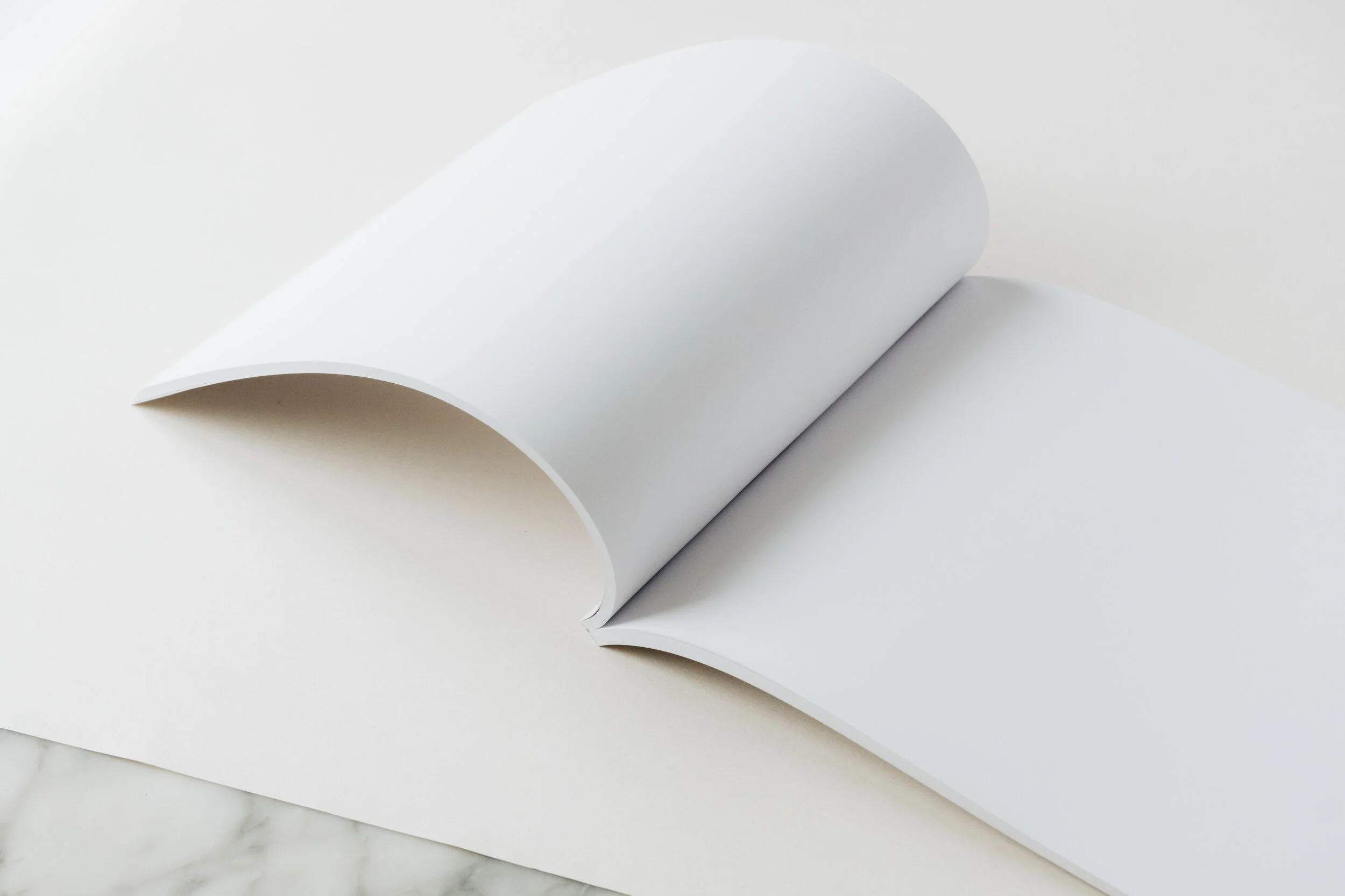
Lastly, we have the weight of the paper. This includes the internal pages as well as the cover. I went with 170gsm for the inside, and 350gsm for the outside. We were originally going to go with 150gsm for the inside, but to make sure the images didn’t show through the other side, we went with 170gsm. For the cover, I went through phases. This will likely happen unless you’re set on something extremely specific from the start. I was up for experimentation, so we went through a few different options, ultimately landing on the textural 350gsm. As you can see above, I requested blank book samples that matched my specifications. This is a great way to truly understand how your book will feel before you start printing. I was able to flip through them, stand them up, flop them around, and get a feel for the size and weight. This is another thing not required, but if your printer is willing, get them to send everything they can. The better you can understand your book pre-printing, the better the final product will be.
Printing
Finding a printer and crossing the finish line.
Finding and dealing with a printer may be the final step in these posts, but truth be told, I found my printer before I was even close to finishing the book. I was actually in talks with them about an entirely different project (shhh), but Transmissions from Japan just happened to wiggle its way in. For the next big project I do, I’ll be in talks with a printer even earlier. Getting paper samples and proofs early on would help streamline the selling & ordering process. So, while printing is technically the last task, I recommend finding a printer you like early. If you have a finished project and you’re ready to make a book NOW, you might have to spread that motivation thinly across another few weeks at least.
Let’s talk about printer options. Other than the number of online printing services like Mixam, XYZ, and Blurb, there are also probably thousands of traditional printing companies out there. Mixam, for example, is the online service I’ve used for past zines, and while I liked the quality, it was nowhere near what I’m working with now. First of all, the communication from my printer is on another level. I’ve basically been assigned a single person from day one, and he’s helped me immensely through every step. Also, the customization is incomparable. The online services give you some nice options, at an often great price, but you’re stuck with what they give you. A traditional printing company can pretty much do anything you want. This means specific papers, coatings, fancy details, zine vs soft vs hardcover, I could go on forever. So, if you’re making something small or simple like a zine, an easy online service is a great option. If you’re making something a bit more serious and time-consuming, I’d say find a “real” printer.
So how do you find one? Well, first, welcome to the internet. Even the smallest of printers tend to at least have their contact information listed somewhere, so don’t let pages two+ of Google scare you. Alternatively, you could ask other people where they printed their work, but unless you have a personal relationship with them, I’d caution you against this. It’s not that people are secretive about their process (maybe some are), it’s that they had to work to find it, so why shouldn’t you? I’ve made the mistake of asking around, and all it ever did was make me feel lazy. Even getting a positive response felt somehow wrong. Instead, the number one best way to find your printer is to look in other books. You can either buy photo books, or you can find somewhere that stocks them so you can flip through a bunch of them. People will often include the printer somewhere in there, and all you have to do is write them down and look them up online. While I was in Lisbon, I went to two or three little shops that stocked big walls of photo books, and I made a giant list of possible printers. I reached out to a few for quotes and eventually landed on my printer. For the sake of everything I just said, I won’t give you that big list, but I will tell you who I used, especially since it’s in the book anyway. I printed Transmissions from Japan through Pureprint out of London. Their clientele ranges from small artists to Nike, so I knew I was in good hands.
The truly final steps of making a photo book are quiet, exciting, and largely personal. The final book proofs for my book should be arriving today, and after I take some photos, they’ll be ready to purchase. Things like pricing, packaging, marketing, and shipping are so specific to the individual experience that I can’t say much about them. On pricing, don’t be ridiculous, but don’t undervalue your work. Books are extremely expensive projects, so make it worth your while. Packaging- don’t skimp, or you’ll be spending more time refunding than you did boxing them up. Marketing is a subject I’d like to talk about in the future, but it’s reliant on so many factors. Do you have a dedicated group of supporters? Who’s your market? These are all questions worth asking before trying to sell a book. Shipping is a pain, especially right now, but all I can say is that it costs what it costs. If you’re afraid shipping costs will scare away customers, well, they might. That doesn’t mean you overpromise. Don’t let shipping come out of your pocket, or you might end up in a surprising amount of debt.
Besides all that, I think we’ve made it to the end. This is everything I’ve been through during this process, so I hope it helps. Transmissions from Japan has been a long time coming, and I’m ready to release it to the world. I’m not used to such big, time-consuming projects, but I think that we’ll be seeing more of them in the future. There’s something special about dedicating a chunk of life to one thing, making it the best you possibly can, and I’m keen to do it all over again. Thank you for taking the time to listen to my process. If you’ve learned anything, or if you’ve been inspired to make your own photo book (or scared away from it), let me know! I’d love to see what you guys are thinking up/working on. I’ll be back with you shortly to show you the finished product, and I can’t wait to see what you think. Thanks again, see you soon.


